You export a campaign visual, drop it into the scheduler, and it looks fine. Then the LinkedIn crop removes the last word of the headline. The Story version turns the product into a thumbnail. The X header puts the logo under the profile photo.
That is not really a “what size is Instagram?” problem. It is a crop-planning problem.
Most social media image-size guides are useful as reference material. Sprout’s current guide alone covers profiles, covers, feeds, Stories, and more. But a long list of pixels can give a false sense of safety: a canvas may meet a platform’s upload rule and still lose the part of the image that mattered.
Here is the more durable approach: choose the placement first, keep the important material inside a protected center, then create deliberate derivatives. It takes slightly more thought before export and saves the familiar “why is the logo gone again?” cleanup afterward.
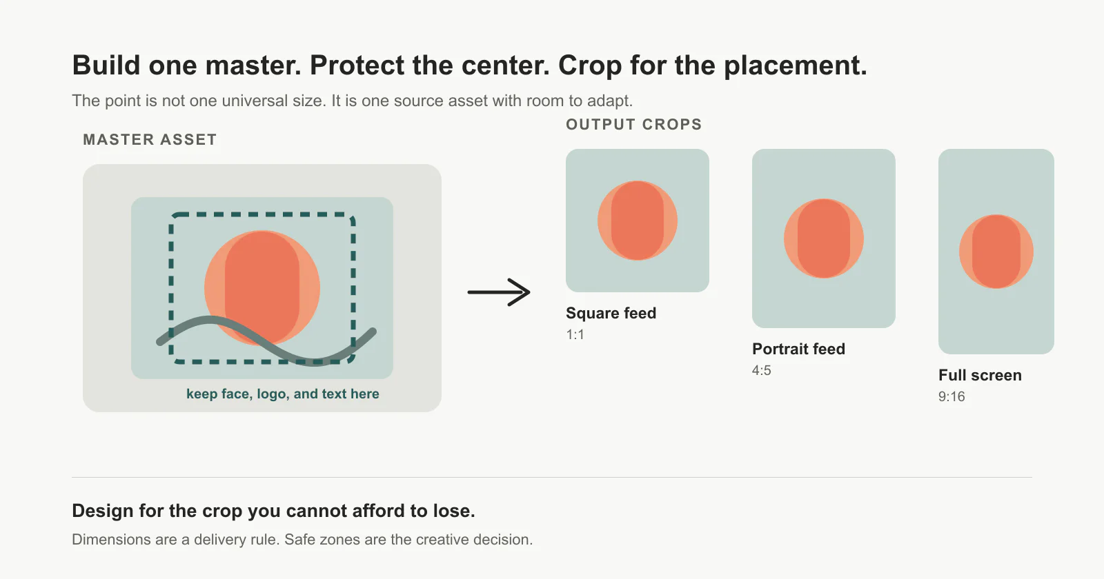
One master image with a protected central safe zone, then square, portrait, and full-screen crop plans
Stop looking for one universal social media image size
There are useful defaults. Hootsuite’s July 2026 reference, for example, lists 1080×1080 for square Instagram images, 1080×1350 for vertical Instagram images, and 1080×1920 for Stories and Reels. It also points out that 4:5 and 9:16 are common mobile-first shapes. Those are sensible starting points, not a license to publish the same finished composition everywhere.
The distinction matters because an image has two jobs:
-
It has to pass the platform’s technical requirements.
-
It has to keep its message intact in the placement where somebody actually sees it.
The first job is dimensions. The second is composition.
Take YouTube as a clean example. YouTube’s own help page recommends a 16:9 custom thumbnail, at the largest practical resolution and at least 640 pixels wide. It also says that on several vertical-video surfaces, a 16:9 custom thumbnail is replaced by an automatically generated 4:5 thumbnail. A perfectly valid 16:9 file can therefore be the wrong visual plan for a Short.
That is why “use 1080×1080 for everything” is a useful emergency fallback, not a content system. A square source travels reasonably well. It does not magically make a wide banner, a tall Story, and a link-preview crop tell the same story.
Start with the placement that cannot compromise
Before opening a template, ask one practical question: where would a bad crop do the most damage?
For a product launch, that might be the 9:16 Story or Reel cover where the title has to survive a phone screen. For a newsletter promotion, it may be the LinkedIn link preview. For a YouTube video, it is the thumbnail, not the post you use to announce it.
Make that placement the source of truth. Then work outward.
| If the critical placement is… | Start with… | Protect… | Usually safe to reuse for… |
|---|---|---|---|
| a mobile feed | a portrait or square master | face, product, headline in the central area | square and portrait feed variants |
| a Story, Reel, or vertical video | a 9:16 master | the center plus room above/below for interface elements | vertical derivatives; not automatically a good banner |
| a video thumbnail or wide link preview | a 16:9 master | the center and any title away from edge crops | wide derivatives; often needs a separate mobile-feed crop |
| a profile or header | the platform-specific canvas | logos, handles, and faces away from known overlay areas | almost nothing; treat it as its own asset |
The table is intentionally not a universal dimensions sheet. Platforms change their rendering rules, and different guides may list different recommendations for different placements. Save the numbers you actually use in your design library, then revisit them when a platform changes its UI.
The safe zone is the part worth designing
A safe zone is not an official rectangle that every network shares. It is your own protected area: the region where a cropped image can lose background but not meaning.
Put the expensive information there:
-
a person’s face or the product you need people to recognize
-
the first few words of a headline, if the image contains text
-
a logo or visual signature that should not disappear
-
the contrast that makes the subject readable on a small screen
Everything outside that zone is allowed to be generous. Background texture, a partial hand, extra scenery, an extended gradient — those are the parts that can take the hit when you turn one composition into several formats.
This is also where lots of “resize” workflows quietly fail. Resizing changes the canvas. It does not decide whether your subject should move, whether the headline still fits, or whether a vertical crop now feels cramped. If the safe zone contains the whole idea, resize. If it does not, adapt the composition.
Reality check: A tool can create nine correct files. It cannot make nine good compositions from one overloaded source image.
Use a three-way decision before exporting
When you need the same campaign visual on more than one platform, do not default to “duplicate and hope.” Use this quick split instead.
Resize
Use the same source image when the subject stays legible after cropping and the only change is canvas shape. A simple product shot with room around it, or a centered portrait with no text near the edges, is a good candidate.
Adapt
Keep the core visual but move or shorten something for the new placement. This is usually the right choice for a social announcement with a title, a price, or a CTA. The campaign stays recognisable, but the vertical version is allowed to breathe differently from the wide one.
Rebuild
Make a separate asset when the placement changes the story. A wide YouTube thumbnail and a vertical Story may use the same photo, but they often need different hierarchy. Likewise, a profile header has interface overlays and deserves its own composition.
That third option is not failure. It is the small bit of craft that keeps cross-posting from looking like an afterthought.
A calmer production workflow for small teams
You do not need a fifty-template design system to do this well. Keep four things with each campaign asset:
-
The master file and the intended focal point.
-
The first-priority placement that determined the composition.
-
A crop note saying what cannot be removed.
-
Only the derivatives you will actually publish.
That last one matters. Do not export every conceivable format just because a guide lists it. If a campaign is going to LinkedIn, Instagram, and an email, make those versions. The rest is inventory, not preparedness.
For a straightforward crop or canvas change, you can use Solnk’s free Social Media Image Resizer. It has presets for nine apps, works in the browser, and lets you crop, zoom, rotate, then download without a sign-up or watermark. Treat it as the delivery step after the creative decision, not the decision-maker.
The useful habit is simple: before you hit export, open the smallest or most awkward placement first. If the image still says what it needs to say there, the rest of the rollout becomes much less dramatic.